Often, you'll want to get the answer to a very specific question out of Quickbase. For example: Which model ear warmer is most popular with customers in Alaska? Or, which of your projects has the most overdue tasks, and—more importantly—who's responsible for them? In other words, how do you get real information out of your data?
It's a challenge to draw meaning out of a large collection of individual records. Two tactics can help: grouping and tallying. How do you implement this two-pronged approach? By creating a Summary report. Use this report type to arrange records in groups that help you see patterns, and total up key amounts that provide you with answers to your questions. In addition, you can sort these reports based on the results of different calculations (total, average, minimum and more), and then click links in the report to see the records that comprise those figures.
Summary report

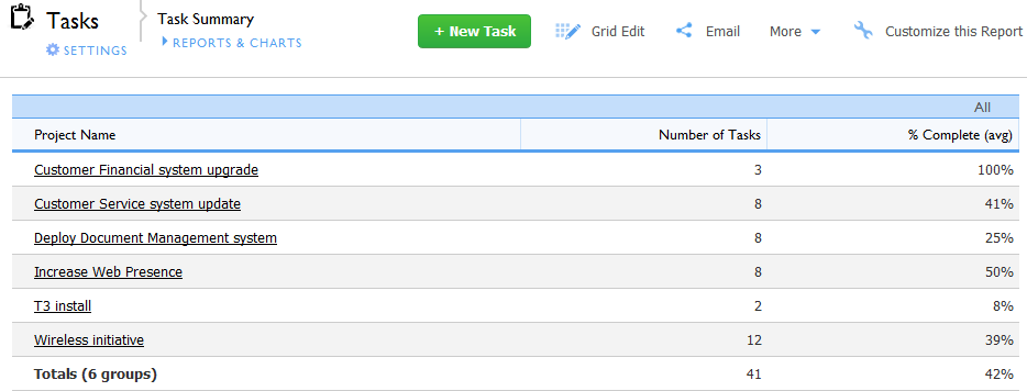
This summary report lists number of tasks per project. It's easy to drill down for details. Click any item to see the group of records that comprise it.
Note: The Totals line displayed in the report above is calculated by the report itself; the value does not exist in a field within Quickbase. If you save the report as a spreadsheet, the totals data is not exported. You also cannot use the data from the Totals line in formulas. Data must exist in a field to be exported and used in formulas. You can create summary fields in a parent table to store total, average, and other summary data from related child records. You can include the summary fields when you run reports on a parent table, and if you export the report the summary field data is exported. Read more about table relationships.
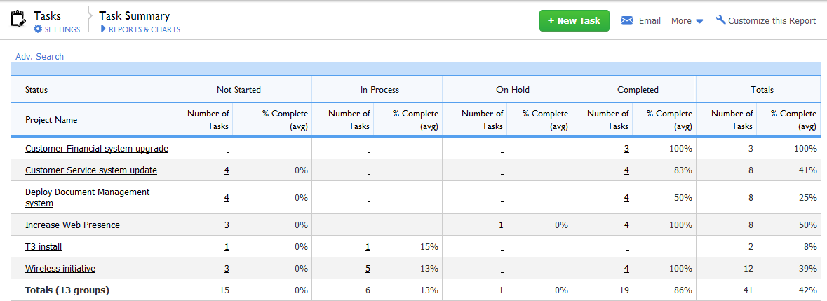
A summary report tells you a lot, but there's a way to draw even more information out of your numbers. If you have a multi-dimensional problem to display, try enhancing your summary report with crosstabs (short for cross tabulation). Summary Crosstab reports are much more flexible in terms of table design because they let you group records in rows or columns. This approach gives you added power—literally another dimension in which to display information. Instead of just showing the number of tasks, you can see how many are in each status. (see the figure below, which is the same summary report as that in the previous image, but with crosstabs added).
Summary Crosstab report

This crosstab report displays the same data in an added dimension. Records from the Status field display as column groupings.
Click any link in the summary chart to see the details. In addition to the obvious links on Project Name and Number of Tasks, the crosstab report also makes the grouping categories into links. If you can customize the summary report, you can specify which report to display when you click a link.
Tip: Each cell in a crosstab report represents a set of records that meet a combination of two variables. For example, 3 is the total number of tasks that have Status Not Started in the Wireless initiative project. That number is a cross tabulation. Read more about crosstab reports at Wikipedia.