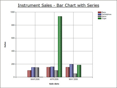
Thanks to an influx of churches, your music store has been selling organs like crazy. Organ sales are off the charts! Literally. Well, not OFF the chart—Quickbase makes sure all your data appears, but that tall green bar in the image below makes it difficult to see how the sales of your other instruments compare with each other.
|
Regular Bar Chart with Series |
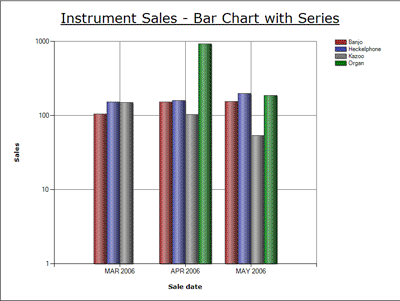
If you want, Quickbase can change the scale in some spots, to make up for your skewed organ sales. That way, you can take a good look at the bulk of your data and make comparisons. Within a logarithmic chart, like the one below, Quickbase changes y-axis increments to decrease large differences.
|
Logarithmic Bar Chart with Series |
To have a chart display in logarithmic format, turn on the Logarithmic Scale checkbox in the Report Builder. (Read more about configuring bar, line and area charts.)
Return to Creating a Chart
Return to Getting Data into Bar, Line and Area Charts

