The process of getting data into a chart, differs depending upon how your data is structured within Quickbase.
Say that you run a music store and you want to compare instrument sales over the last few months. You'd like to compare each month's sales, breaking down the number by product. The vision you have in your imagination looks something like this:
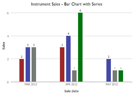
The Goal: A chart showing sales for each month, including bars for each individual instrument.
How do you produce a chart like this? That depends on how you've entered this data into Quickbase.
The key to deciding on an approach
The choices you make in the Report Builder depend upon the answer to the following question:
Do the values you want to show (in this case, instruments) exist as values within ONE field? Or do they each have their own field (column)?
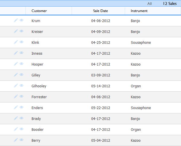
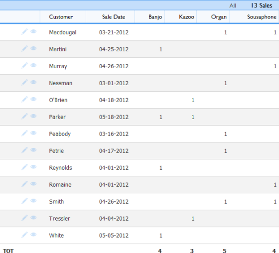
For example, the first image below shows a table report where instruments all live within one field. The second image shows a different setup. Each instrument has its own field.
|
Instruments are values within a field |
Each instrument is a field |
If your data looks like the report on the left...
Select one field within the Report Builder's Data (y-axis) values section, then select a field in the Series section. To do so:
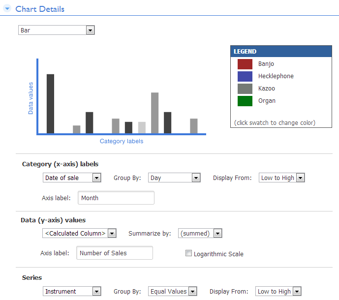
Within the Report Builder (access this screen by creating a chart), go to the Data (y-axis) values section and select the field you want to use as your chart's measure (like "number of sales"). Then, to get the breakdown by related category ("Instrument" in this example), go to the Series section's Select a field dropdown, choose the field containing the values. Once you do so, Quickbase displays all the values from the field within the Report Builder's Legend box, indicating that they'll appear on your chart. Settings for this data structure should look like this:
Return to Getting Data into Bar, Line and Area Charts
If your data looks like the report on the right....
Select all desired fields within the Report Builder's Data (y-axis) values section. To do so:
If you're not in the Report Builder already, create the report. With a multi-field setup, your sales numbers are scattered across all the individual instrument fields (like banjo, guitar and so on). To get them all on your chart, you need to select each field in the Data (y-axis) values section, as pictured below. To add additional fields, click the plus sign icon that appears when you hover your mouse over the field you've already specified.
Note: If you don't see a plus sign icon in the Data (y-axis) values section, the cause is one of the following:
-
You've selected a summed field from the y-axis dropdown. When you select a field that Quickbase sums (like # of Sales in above, you're already showing all possible values on the chart. Adding specific instrument fields here would be overkill. After all, Banjo or Kazoo sales are already represented on the chart—as a part of the total. To help you differentiate between field types within the dropdown, Quickbase puts summed fields bottom of the list in a separate section. The program displays the plus sign icon only when you select a numeric field that represents a PART of your total data.
-
You've selected a field within the Series section. You can't select multiple fields within the Data (y-axis) values section AND select a series too. Clear your selection in the Series section by clicking the Series dropdown and choosing Select a field...
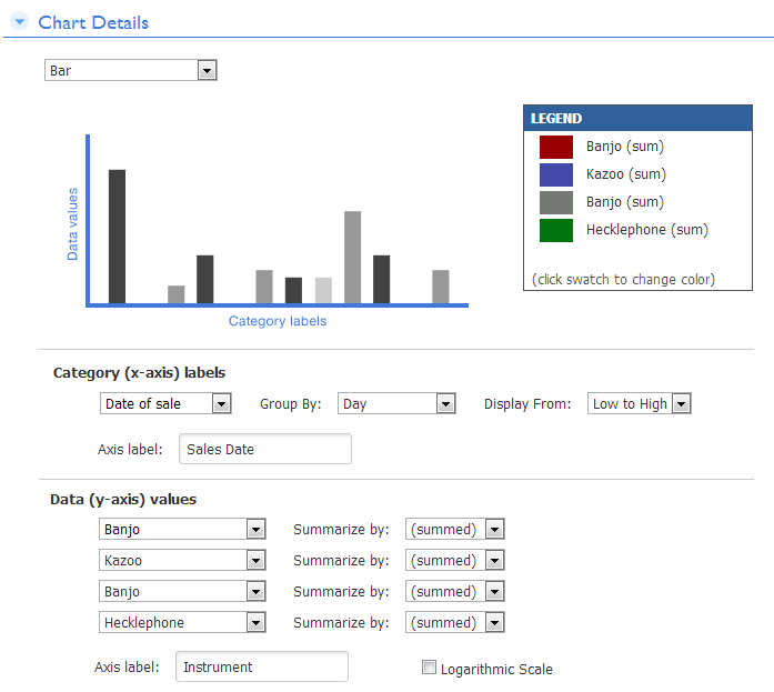
Configuring a chart when values live in multiple fields
Return to Getting Data into Bar, Line and Area Charts
Creating Charts for Data in Multiple Tables
What if your data is spread across multiple tables? If you want to show data from multiple tables, you must have a relationship in place between the tables. This is a MUST. (Learn how to create a relationship.)
Once you've created a relationship, you can design a chart just as you would for either scenario above. Again, the trick is to look at your data and ask yourself, "Do the values I want to show live in one field or in separate fields?" If they live in a single field, select it from the Series dropdown. In a relationship, this may be a reference field to a parent table. If the values live in separate fields, you may need to create additional lookup fields to get them on your chart.
